By Stormly in Knowledge
Published: Nov 13, 2025
Cart Abandonment Report: See Where Revenue Slips Away, SKU by SKU
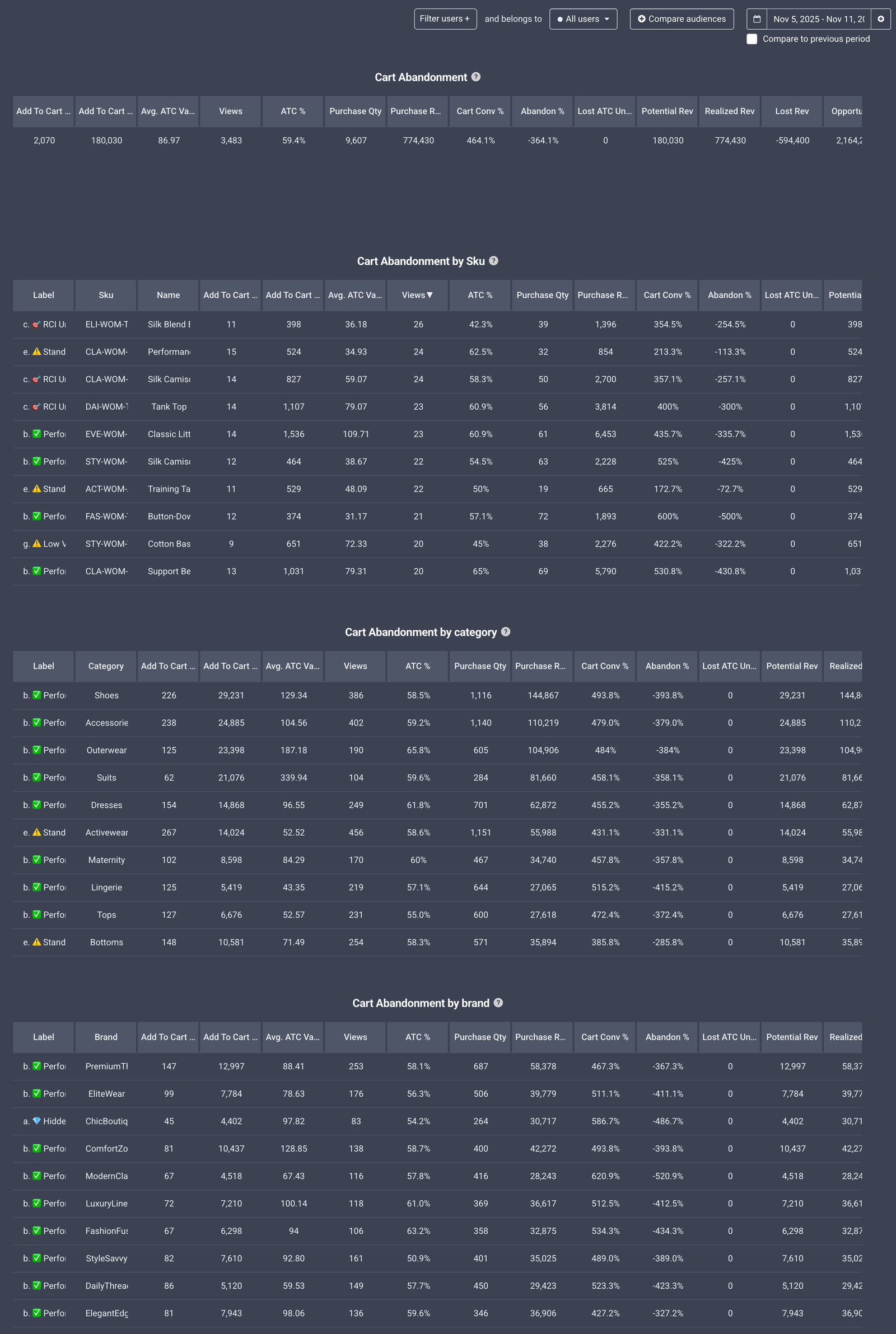
Every ecommerce team talks about conversion. Fewer talk about the exact moment where money leaks out of the basket. That is what cart abandonment is all about. Our Cart Abandonment Report gives you a clear view of where customers add items to cart but do not buy, down to the SKU, brand, and category. It is practical, it is actionable, and it plugs right into the tools you already use: Shopify, Adobe ecommerce, or Google Tag Manager.
Why This Report Matters
Cart abandonment is not just a top level rate. It hides dozens of different problems that look the same in aggregate but need different fixes. A size chart that is hard to find. A price that does not match expectations. A variant that is often out of stock. Shipping costs that surprise people at checkout. When you only look at a single sitewide abandonment number, you cannot see any of that.
With a SKU level view, you can:
- Spot high intent products that fail to convert
- Compare brands and categories to find systemic issues
- Run week-over-week comparisons to spot shifts in cart abandonment by brand, category, or even individual SKUs
- Size the prize in real revenue and margin terms
- Prioritize fixes that actually move the needle
What Makes This Report Special
1) True SKU, brand, and category visibility
Most tools stop at a funnel step. We go deeper. You see adds to cart and purchases side by side for each SKU, then roll up to brand and category. That makes it obvious when interest is strong but something breaks before purchase.
2) Lost revenue and opportunity sizing
It is not enough to know that people drop off. You need to know what it is worth to fix. The report estimates lost revenue and, if you provide margins, lost margin as well. This turns a long list of ideas into a ranked action plan.
3) Benchmarks you can trust
We compare each SKU to its category peers so you can tell if a product is truly underperforming or if the whole category needs attention. That saves time and avoids chasing noise.
4) Works with your stack
You do not have to rebuild tracking. We ingest your data from Shopify, Adobe ecommerce, or Google Tag Manager. If you already collect add to cart and purchase events, you are basically done.
The Core Metrics You Get

Simple, Reliable Setup
We plug into your existing data in a few ways:
-
Shopify
Use your standard add to cart and purchase data. No special theme changes required in most cases. -
Adobe ecommerce
Map your product, brand, and category dimensions. We handle the joins. -
Google Tag Manager
If your data layer already sends add to cart and purchase events with product IDs, we can pick that up. If not, we give you a short checklist to enable it.
Once connected, we compute the metrics automatically and refresh them on your chosen schedule.
Best Practices for Clean Insights
- Track units, not just events. If one add can include multiple units, capture quantity.
- Include price and margin where possible. It unlocks better prioritization.
- Exclude periods of zero stock when judging conversion, or at least label them.
- Set a minimum volume threshold so you do not overreact to low sample sizes.
- Review weekly and monthly. Weekly catches issues fast. Monthly confirms the trend.
Examples of Questions You Can Finally Answer
- Which SKUs have the biggest gap between interest and purchase
- Which brands underperform their category peers
- Where would a free returns message help most
- Which sizes or colors drive adds during stockouts
- What is the revenue upside if product page improvements raise conversion by a small amount
Turning Insight Into Action
1) Sort by Lost Revenue and pick the top 10 SKUs.
2) For each, check imagery, copy, reviews, sizing, price, shipping costs, and availability.
3) Run small, targeted tests. This can be a new photo set, a price nudge, or a shipping threshold change.
4) Track the Cart Conversion change and keep what works.
5) Roll the winning changes across similar SKUs and to the brand or category level.
Let Our AI Agent Do the Heavy Lifting
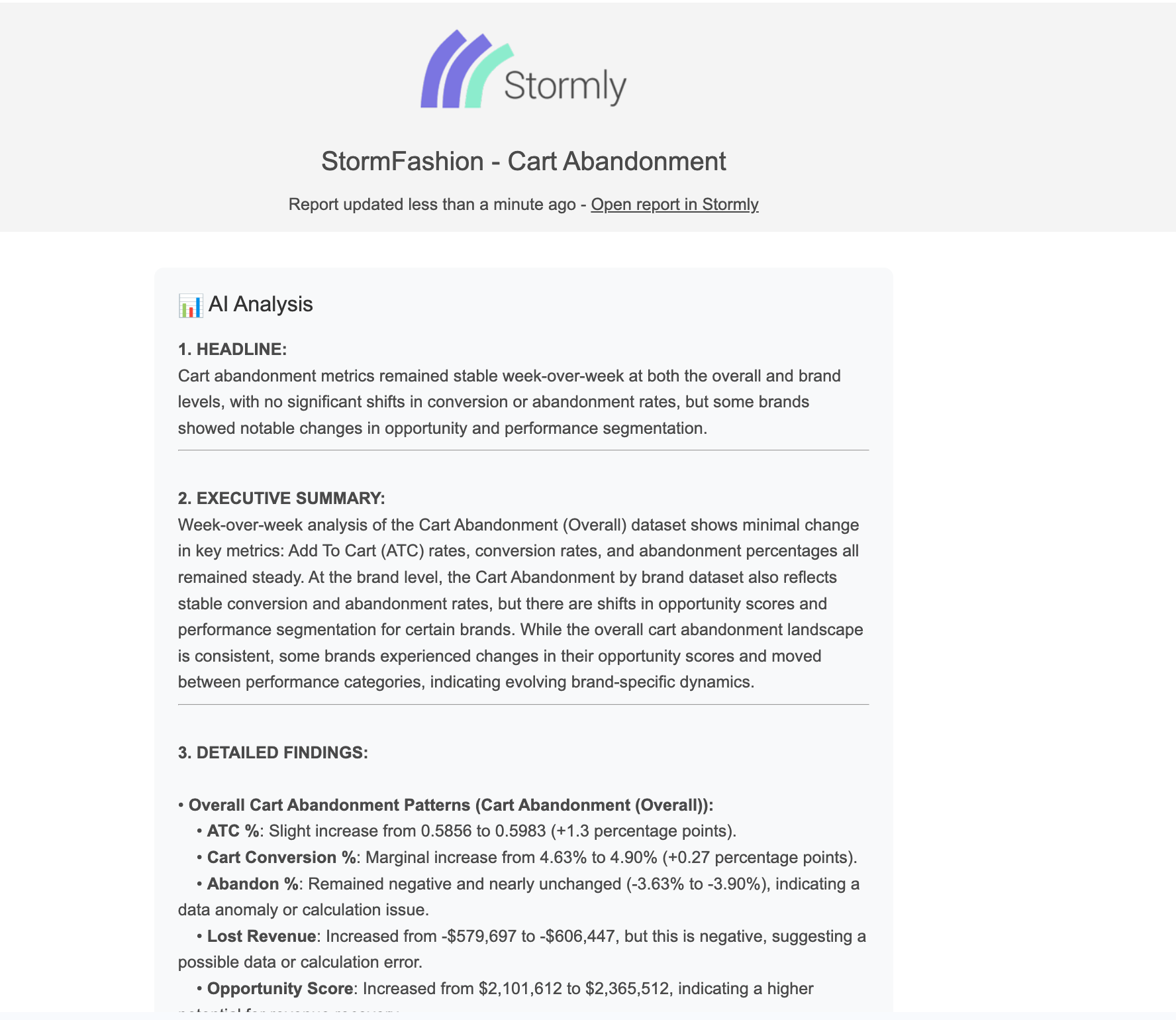
The best part is you do not have to hunt for insights. Our AI agent reads this report for you and sends the highlights to your inbox with clear explanations and next steps. Choose a schedule that fits your routine, daily or weekly. You will get:
- A short summary of what changed since the last run
- The top SKUs and brands to focus on, with why they matter
- Suggested actions you can take right away
- Links back to the detailed report for deeper dives
This saves hours of manual digging and turns your analytics into simple, ready to act playbooks.
Frequently Asked
Do I need developers to get started with Stormly?
Usually not. If your Shopify or Adobe setup already tracks adds and purchases, you are set. With GTM, a quick data layer check is enough in most cases.
Can I include refunds and cancellations?
Yes. If you provide the data, we calculate a net purchase metric for an even truer read.
What about bundles or variants?
We can report at variant level and also roll up to a parent SKU so you can compare both views.
Will this slow down my site?
No. We read the data you already collect. Nothing heavy runs in the browser.
The Payoff
Fixing cart abandonment at the product level is one of the fastest ways to grow revenue without buying more traffic. You focus on the small set of SKUs where customers raise their hand but something stops them. That is where copy tweaks, better photos, clearer sizing, and small price or shipping changes yield outsized returns.
If you want to see your own products through this lens, connect via Shopify, Adobe ecommerce, or Google Tag Manager to Stormly and run the Cart Abandonment Report. It is the simplest path from hidden gaps to real growth.

