By Stormly in Product Update
Published: Sep 23, 2021
How to make your dashboards more actionable
It’s easy to get into the habit of simply adding charts and metrics to your dashboard without really thinking about how it impacts its usability. But If you find yourself in a situation where the data in your dashboard is not showing properly all of the information, or you need to add a new metric but don’t know how then there are a few formatting tricks that will not only make your data pop-out in an aesthetically pleasing way, but also make more sense to your teammates.
This blog post will walk you through some easy formatting tips for making your dashboards look great!
Having a possibility to modify the things like “days” and “hours” may seem small but can make a huge difference when looking at charts. So read on!
Dashboards are a vital way for companies to stay up-to-date with their business. That’s why with Stormly, it is easy to make your dashboards more relevant by fine tuning and formatting charts, metrics or numbers. This way, you can map those Insight numbers exactly as they relate back to the terms used within your company culture.
This is something that will help your team understand the results better than before.
We’ll start by opening the Basic Reporting Insight, and running “Count Events”. We need to pick a property of our payment event so that we can save it for later use in an upcoming project. I’m going with the price because who doesn’t love numbers!
I saved my insight now, so let’s add this onto the Financial Dashboard.
Next, we want to forecast our revenue. Accessing the Forecasting Insight and selecting “Total of Event Attribute” will give us a glimpse at how much money is coming from each source for this particular event attribute over time by summing up all its values in one spot.
It can be pieced together easily when you’re looking back through old data or planning ahead using your current knowledge base about what might happen next!
We picked price as our property earlier because that seemed most applicable here– but now let’s see if there are any other possibilities.
There seems to be quite an assortment available on this page. Maybe something different than just ‘price’? Let’s see what seasonality is like and when it can peak for your industry.
With this Insight, you will know exactly why certain days are challenging during sales or marketing campaigns!
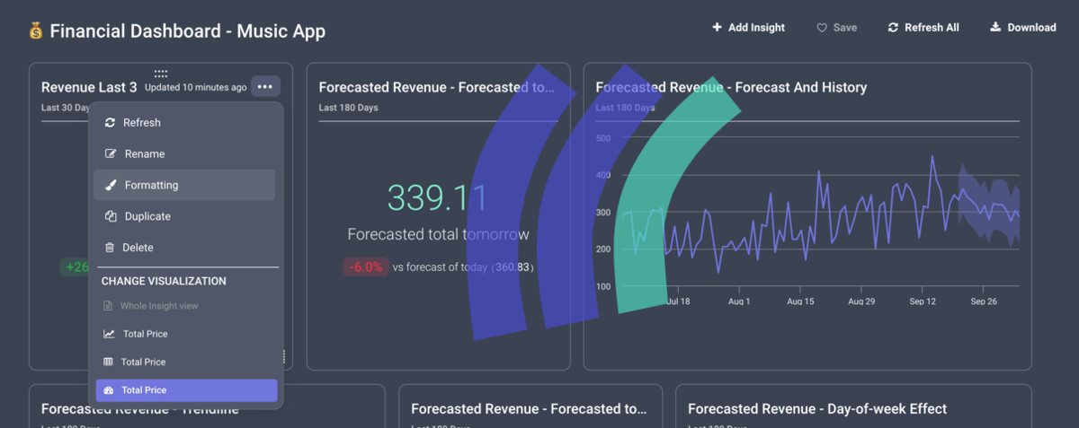
Our financial dashboard is now complete. It only takes a few clicks to get from here all the way through your finances in order and organized for you!
This looks great, and gives us a quick overview of our past and future revenue.
As you can see, Stormly is a one stop shop for all your team needs. You can go in deeper and fine-tune the dashboard to make it more intuitive, which means less confusion among members on what they should be doing at any given time
With Stormly you’ll have everything covered from A through Z–and we mean every aspect of your data analytics needs. With our easy interface anyone could use this software without getting lost or overwhelmed!
Using our formatting option, you can customize the labels, number formatting and even transform numbers with custom calculations. You might want to change how much things are worth or which currency they’re denominated in, and that’s where we come in!
First up, add a dollar sign before all revenue values, then remove any decimal points.
Now let’s rename the default labels “Total Price” and “Forecasted Total Tomorrow”, and let’s just use “Revenue.” Simple!
Some people in our marketing and product teams are based across Europe, so we transform those dollar values into euros for them. We’ll duplicate an existing dashboard item named ‘Revenue Last 30 days’ with some formatting tweaks to make things easier!
An example would be multiplying the value by 0.85 since euros equals 85 cents in US Dollar currently.
And voila! You’re now the proud owner of a fully customized dashboard, showing revenue in dollars and euros. All other custom labels have been applied to this one-of-a kind design which makes for an even more impressive presentation:
There’s more to Stormly than meets the eye. We’ve got features that will sweep away competitors like Amplitude or Pendo!
And one thing is sure - if you want an accurate dashboard that provides your team with actionable data and insights in real-time then look no further! Sign up today.


